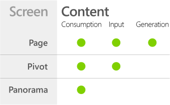
Windows Phone apps, built out of “the 3 P’s”: Panoramas, Pivots, and Pages
January 29, 2012
I can’t post a new component or library every day, but I can point you at other great blogs and folks on Twitter that would be super useful to app devs and teams building on the Microsoft stack.
This afternoon I read another of Arturo Toledo’s amazing series on Windows Phone Design – and it’s a simple but important point: apps are not just a choice between a Page, a Panorama, or a Pivot: many apps have aspects of all of these. The Music+Videos hub on the phone is built of all 3, and your app can pull that off, too: just understand the ideal content and purposes of these different types of core experiences.
31 Weeks of Windows Phone Metro Design | #5 Choosing between Panoramas, Pivots and/or Pages
Arturo Toledo
Senior User Experience Designer – Windows Phone Team at Microsoft

I “borrowed” this image from Arturo’s post.
He’s had other great posts in the past, too, and expect great content to come.