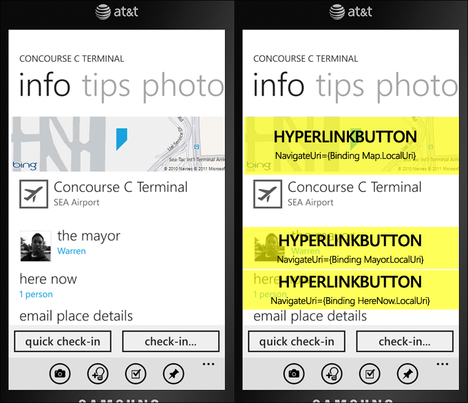
Drive your application’s navigation through templated HyperlinkButtons and smart data binding to app-wide URIs
October 31, 2011
A majority of the navigation throughout my application’s many pages and experiences are powered by the HyperlinkButton control. It’s fun and easy to data bind, and something I pointed out in a Channel 9 video that was being recorded this morning.
I wanted to share this simple method with others – it’s so easy to re-template HB, and it removes the need to have code-behind for handling touches on buttons and other visual elements. It’s also a good way to create large hit-target friendly places for your users’ to touch.
I even make it more simple by exposing a ‘LocalUri’ property on almost all of my data objects, navigating to the proper contextual page for the item, complete with the identifying data in the URI, so that the new page can work from anywhere. It’s fun and quick to data bind.
HyperlinkButton Benefits
- No code behind is needed to navigate to pages within your application or even a web page in Internet Explorer
- Easy to data bind the NavigateUri if you expose a local navigation Uri property on your model / view model / data bound objects
- Mimics the Windows Phone’s metro UI that offers similar concepts throughout the People hubs and other apps
- Saves lots of useless code for calling NavigationService.Navigate
- Cuts down on bugs since your data objects provide their own app navigation URIs, so you can make bug fixes and changes in a centralized place
Large touch targets
One thing I di was enlarge the touch targets. I make sure that the hyperlink button is stretched to the width of the phone, so you can touch the item even easier. In the image above, if you imagine a poorer implementation, the hyperlink button might end right at the edge of the “here now” text, making it more difficult to touch:
Instead I make sure the item is stretched so there’s more space for someone to interact by setting HorizontalAlignment to Stretch on the control, etc.
Touch target testing made easy
An easy way to test your touch targets while developing is to temporarily modify your central “EmptyButtonStyle” style and have the Grid background set to Yellow (or another color) temporarily. Then you can walk through your application and easily see the touch targets your hyperlink buttons are exposing.
Tilt effect
Make sure to use the Silverlight for Windows Phone Toolkit’s TiltEffect. Since HyperlinkButton derives from ButtonBase, you will get the nice tilt effect for free this way when you use it on your pages.
Styling the inner content
Things that I look for when placing content inside such a hyperlink button includes alignment, spacing (6, 12, 24px offsets), and coloring. I try and mimic much of the user interface that I see throughout the Windows Phone’s main apps, as well as using the standard Styles and static resources provided in the framework.
The idea of my “EmptyButtonStyle” is that whatever content you put inside is the control, otherwise it has no visuals.
A common piece of XAML might look like this:
<HyperlinkButton
    NavigateUri="{Binding HereNow.LocalUri}"
    Margin="0,12,0,0"
    HorizontalAlignment="Stretch"
    HorizontalContentAlignment="Left"
    Style="{StaticResource EmptyButtonStyle}">
    <StackPanel>
        <TextBlock
            Style="{StaticResource PhoneTextLargeStyle}"
            Text="here now" />
        <TextBlock
            Style="{StaticResource PhoneTextNormalStyle}"
            Foreground="{StaticResource PhoneAccentBrush}"
            Text="{Binding HereNow.Text, Converter={StaticResource Cap}, ConverterParameter=lowercase}" />
    </StackPanel>
</HyperlinkButton>
My HyperlinkButton style (also works with Button)
This is the template that I use. By placing it in my App.xaml file, it is accessible anywhere throughout my application, making it easy and quick to use. I actually expose both a Style and a ControlTemplate in my app, but the Style should be fine for most folks.
<Style x:Key="EmptyButtonStyle" TargetType="primitives:ButtonBase">
    <Setter Property="Background" Value="Transparent" />
    <Setter Property="Padding" Value="0" />
    <Setter Property="Template">
        <Setter.Value>
            <ControlTemplate TargetType="primitives:ButtonBase">
                <Border Background="{TemplateBinding Background}"
                    Padding="{TemplateBinding Padding}">
                    <ContentPresenter
                    HorizontalAlignment="{TemplateBinding HorizontalContentAlignment}"
                    VerticalAlignment="{TemplateBinding VerticalContentAlignment}"
                    Content="{TemplateBinding Content}"
                    ContentTemplate="{TemplateBinding ContentTemplate}"/>
                </Border>
            </ControlTemplate>
        </Setter.Value>
    </Setter>
</Style>
Don’t forget to set the xmlns primitives at the top of your App.xaml (or page’s XAML):
xmlns:primitives="clr-namespace:System.Windows.Controls.Primitives;assembly=System.Windows"
Since it actually targets ButtonBase, you can use it with regular Buttons, as well as hyperlink buttons. Hope this helps!

