Using AutoCompleteBox in a Windows Phone Panorama or Pivot item
March 9, 2011
With some quick re-templating action, you can use AutoCompleteBox from the toolkit in a Panorama or Pivot control page for Windows Phone. This is one of the key customer asks from folks developing WP7 apps that I hear often.
The good news is that this can be accomplished with simple re-templating of the AutoCompleteBox control, and a little visual trickery.
The bad news is that I’m not sure that we will be able to address the CodePlex work item to officially support this, work item 7574 with 21 votes so far (a popular issue!), because of the technical limitations at play here: the control itself uses a child Popup in the template to display the results, showing them on top of your page and content. When used in a Panorama or Pivot, there are issues here where the Popup doesn’t properly align on the page, or work at all.
There are three steps to doing this:
- Making sure that you have a Visibility converter available in your app (most already have this)
- Designing the visuals with grids to include a placeholder and a spanning content area on top of your pivot/panorama items’ content
- Retemplating your AutoCompleteBox when used
For this example, I’m starting with the standard Windows Phone Pivot Application template so that you can follow along. This is best described as “hack quality” so proceed at your own risk. I want to unblock people that believe this is not possible, so here it is.
Also, with this workaround, the Visual Studio design surface is unable to continue working due to an issue resolving RelativeSource at runtime. You’ll want to comment out some of it while working on your design.
Visual trickery, illustrated
The trick to this re-template is to remove the popup from the template. Instead, we need to “fake” the popup experience by overlaying the results of the AutoCompleteBox (when searching) on top of the visuals in the PivotItem or PanoramaItem.
As always, I believe re-templating is a core Silverlight development technique. Though often a last resort before modifying the code of controls or building your own, it is a super important concept to master.
To do this, start with a standard Pivot control or Panorama item template and make these changes to the item that will contain your search box.
- The root element of the item must be a Grid, not a StackPanel
- It must define at a minimum 2 rows: the first row has a hard-coded height of 72 that will represent the search/text box of the AutoCompleteBox, effectively a “placeholder”
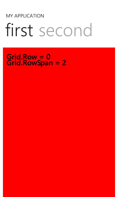
- The last visual needs to be another Grid, with Grid.Row set to 0, and the RowSpan to span the entire number of rows defined in the child of the pivot/panorama item. This is to fake the effect of a “popup” by allowing visuals to be on top.
I understand this concept can be a little confusing, which is yet another reason we can’t really just change the template for all AutoCompleteBox examples. I might add this template to the sample project in the future, however!
The reason the last item needs to be the “overlay” grid is that XAML at the bottom of an item has a higher z-order than the rest, acting similar to a popup.
So visually, we define first a basic grid in the item.
The XAML might look like this now – you can follow along in the default pivot app project to see what’s different.
<controls:PivotItem Header="first">

    <Grid>

        <Grid.RowDefinitions>

            <RowDefinition Height="72"/>

            <RowDefinition/>

        </Grid.RowDefinitions>


        <!-- Row 0 is a 'placeholder' for the AutoCompleteBox control -->


        <ListBox

            Grid.Row="1"

            x:Name="FirstListBox" Margin="0,0,-12,0" ItemsSource="{Binding Items}">

            <ListBox.ItemTemplate>

                <DataTemplate>

                    <StackPanel Margin="0,0,0,17" Width="432">

                        <TextBlock Text="{Binding LineOne}" TextWrapping="Wrap" Style="{StaticResource PhoneTextExtraLargeStyle}"/>

                        <TextBlock Text="{Binding LineTwo}" TextWrapping="Wrap" Margin="12,-6,12,0" Style="{StaticResource PhoneTextSubtleStyle}"/>

                    </StackPanel>

                </DataTemplate>

            </ListBox.ItemTemplate>

        </ListBox>

    </Grid>

</controls:PivotItem>
This defines a placeholder (Row 0) and the content of the item (Row 1). Row 0 is where the text box visually should be overlaid. Visually, this is sort of what this is about enabling from a spacing perspective:
Now, we add the “overlay” grid. For this purpose, I temporarily colored it Red to show that it overlays the earlier items:
In the actual world, this is where you want to put in the overlay grid and eventually the AutoCompleteBox.
So the updated code is similar to this:
<controls:PivotItem Header="first">

    <Grid>

        <Grid.RowDefinitions>

            <RowDefinition Height="72"/>

            <RowDefinition/>

        </Grid.RowDefinitions>


        <!-- Row 0 is a 'placeholder' for the AutoCompleteBox control -->


        <ListBox

            Grid.Row="1"

            x:Name="FirstListBox" Margin="0,0,-12,0" ItemsSource="{Binding Items}">

            <ListBox.ItemTemplate>

                <DataTemplate>

                    <StackPanel Margin="0,0,0,17" Width="432">

                        <TextBlock Text="{Binding LineOne}" TextWrapping="Wrap" Style="{StaticResource PhoneTextExtraLargeStyle}"/>

                        <TextBlock Text="{Binding LineTwo}" TextWrapping="Wrap" Margin="12,-6,12,0" Style="{StaticResource PhoneTextSubtleStyle}"/>

                    </StackPanel>

                </DataTemplate>

            </ListBox.ItemTemplate>

        </ListBox>


        <!-- The AutoCompleteBox experience -->

        <!-- Must be the last XAML in the Grid to ensure a top z-order -->

        <!-- It must span the entire grid, starting with row 0. -->

      <Grid Grid.Row="0" Grid.RowSpan="2">

      </Grid>

    </Grid>

</controls:PivotItem>
Ok. We’re closer now that the basics are there. If you run the project, you’ll still see simply your content, with space at the top where the AutoCompleteBox (text box part) will go.
A required visibility converter
Since we replaced the pivot, we need to instead toggle the visibility of the list box for showing results only when the IsDropDownOpen dependency property is set to true. This is easy enough using a relative source binding (similar to a template binding) plus adding a Visibility converter to the project, and using it in the template.
Here’s a super simple visibility converter to get started. Add it as a class file to your project.
using System;

using System.Windows;

using System.Windows.Data;


namespace Microsoft.Phone.Controls

{

    public class VisibilityConverter : IValueConverter

    {

        public object Convert(object value, Type targetType, object parameter, System.Globalization.CultureInfo culture)

        {

            bool visible = true;


            if (value is bool)

            {

                visible = (bool)value;

            }

            else if (value is int || value is short || value is long)

            {

                visible = 0 != (int)value;

            }

            else if (value is float || value is double)

            {

                visible = 0.0 != (double)value;

            }

            else if (value == null)

            {

                visible = false;

            }


            if ((string)parameter == "!")

            {

                visible = !visible;

            }


            return visible ? Visibility.Visible : Visibility.Collapsed;

        }


        public object ConvertBack(object value, Type targetType, object parameter, System.Globalization.CultureInfo culture)

        {

            throw new NotImplementedException();

        }

    }

}
And then to the page, add it as a resource, plus the XMLNS for “localControls” pointing to the Microsoft.Phone.Controls namespace. I use the key name Vis.
        <!-- Make the visibility converter available -->

        <Grid.Resources>

            <localControls:VisibilityConverter x:Key="Vis"/>

        </Grid.Resources>
Now we’ll use it in the template.
The new template
Now we want to re-template the AutoCompleteBox. You could define the template once in App.xaml, but for simplicity I just did this inline. The most important parts are:
- Removing the Popup template part
- Adding a Visibility relative source binding to show/hide the results at the appropriate time
- The listbox and textbox in the template are moved into a grid-row structure visually
This takes advantage of the idea that template parts in controls are usually “optional”, so without the Popup in there, it still functions just fine in the app.
So this now adds to the overlay grid…
- AutoCompleteBox instance
- Sets the item template, filter parameters, etc., as an example
- Sets the ControlTemplate
Here is the ControlTemplate if you are just copying and pasting into your own app:
<ControlTemplate TargetType="toolkit:AutoCompleteBox">

    <Grid>

        <Grid.RowDefinitions>

            <RowDefinition Height="Auto"/>

            <RowDefinition/>

        </Grid.RowDefinitions>

        <TextBox

            x:Name="Text"

            Background="{TemplateBinding Background}"

            BorderBrush="{TemplateBinding BorderBrush}"

            BorderThickness="{TemplateBinding BorderThickness}"

            FontFamily="{TemplateBinding FontFamily}"

            FontSize="{TemplateBinding FontSize}"

            FontStyle="{TemplateBinding FontStyle}"

            FontWeight="{TemplateBinding FontWeight}"

            Foreground="{TemplateBinding Foreground}"

            InputScope="{TemplateBinding InputScope}"

            Opacity="{TemplateBinding Opacity}"

            Padding="{TemplateBinding Padding}"

            Style="{TemplateBinding TextBoxStyle}"/>

        <ListBox

            Margin="12"

            Visibility="{Binding Path=IsDropDownOpen, RelativeSource={RelativeSource TemplatedParent}, Converter={StaticResource Vis}}"

            Grid.Row="1"

            x:Name="Selector"

            Background="White"

            FontFamily="{TemplateBinding FontFamily}"

            FontSize="{TemplateBinding FontSize}"

            FontStyle="{TemplateBinding FontStyle}"

            FontWeight="{TemplateBinding FontWeight}"

            Foreground="{TemplateBinding Foreground}"

            IsTabStop="False"

            ItemContainerStyle="{TemplateBinding ItemContainerStyle}"

            ItemTemplate="{TemplateBinding ItemTemplate}"

            Opacity="{TemplateBinding Opacity}"

            BorderBrush="{StaticResource PhoneTextBoxEditBorderBrush}"

            BorderThickness="{TemplateBinding BorderThickness}"

            Padding="0,8"/>

    </Grid>

</ControlTemplate>
The Visibility binding on the ListBox is important, as it is what keeps the ListBox from being displayed over your existing page content at runtime. It uses the resource we defined for the visibility converter, Vis. Relative source binding is used to make it very similar to a template binding with a converter.
And so the final XAML for the PivotItem looks like this expanded:
<controls:PivotItem Header="first">

    <Grid>

        <Grid.RowDefinitions>

            <RowDefinition Height="72"/>

            <RowDefinition/>

        </Grid.RowDefinitions>


        <!-- Row 0 is a 'placeholder' for the AutoCompleteBox control -->


        <ListBox

            Grid.Row="1"

            x:Name="FirstListBox" Margin="0,0,-12,0" ItemsSource="{Binding Items}">

            <ListBox.ItemTemplate>

                <DataTemplate>

                    <StackPanel Margin="0,0,0,17" Width="432">

                        <TextBlock Text="{Binding LineOne}" TextWrapping="Wrap" Style="{StaticResource PhoneTextExtraLargeStyle}"/>

                        <TextBlock Text="{Binding LineTwo}" TextWrapping="Wrap" Margin="12,-6,12,0" Style="{StaticResource PhoneTextSubtleStyle}"/>

                    </StackPanel>

                </DataTemplate>

            </ListBox.ItemTemplate>

        </ListBox>


        <!-- The AutoCompleteBox experience -->

        <!-- Must be the last XAML in the Grid to ensure a top z-order -->

        <!-- It must span the entire grid, starting with row 0. -->

        <!-- Warning: the design surface does not like this template unfortunately -->

        <!-- AutoCompleteBox must be vertically aligned with the placeholder -->

        <Grid Grid.Row="0" Grid.RowSpan="2">

            <toolkit:AutoCompleteBox

                ValueMemberBinding="{Binding LineOne}"

                FilterMode="ContainsCaseSensitive"

                x:Name="_autoCompleteBox"

                ItemsSource="{Binding Items}"

                VerticalAlignment="Top">

                <toolkit:AutoCompleteBox.ItemTemplate>

                    <DataTemplate>

                        <TextBlock Text="{Binding LineOne}" TextWrapping="Wrap" Style="{StaticResource PhoneTextExtraLargeStyle}"/>

                    </DataTemplate>

                </toolkit:AutoCompleteBox.ItemTemplate>

                <toolkit:AutoCompleteBox.Template>

                    <ControlTemplate TargetType="toolkit:AutoCompleteBox">

                        <Grid>

                            <Grid.RowDefinitions>

                                <RowDefinition Height="Auto"/>

                                <RowDefinition/>

                            </Grid.RowDefinitions>

                            <TextBox

                                x:Name="Text"

                                Background="{TemplateBinding Background}"

                                BorderBrush="{TemplateBinding BorderBrush}"

                                BorderThickness="{TemplateBinding BorderThickness}"

                                FontFamily="{TemplateBinding FontFamily}"

                                FontSize="{TemplateBinding FontSize}"

                                FontStyle="{TemplateBinding FontStyle}"

                                FontWeight="{TemplateBinding FontWeight}"

                                Foreground="{TemplateBinding Foreground}"

                                InputScope="{TemplateBinding InputScope}"

                                Opacity="{TemplateBinding Opacity}"

                                Padding="{TemplateBinding Padding}"

                                Style="{TemplateBinding TextBoxStyle}"/>

                            <ListBox

                                Margin="12"

                                Visibility="{Binding Path=IsDropDownOpen, RelativeSource={RelativeSource TemplatedParent}, Converter={StaticResource Vis}}"

                                Grid.Row="1"

                                x:Name="Selector"

                                Background="White"

                                FontFamily="{TemplateBinding FontFamily}"

                                FontSize="{TemplateBinding FontSize}"

                                FontStyle="{TemplateBinding FontStyle}"

                                FontWeight="{TemplateBinding FontWeight}"

                                Foreground="{TemplateBinding Foreground}"

                                IsTabStop="False"

                                ItemContainerStyle="{TemplateBinding ItemContainerStyle}"

                                ItemTemplate="{TemplateBinding ItemTemplate}"

                                Opacity="{TemplateBinding Opacity}"

                                BorderBrush="{StaticResource PhoneTextBoxEditBorderBrush}"

                                BorderThickness="{TemplateBinding BorderThickness}"

                                Padding="0,8"/>

                        </Grid>

                    </ControlTemplate>

                </toolkit:AutoCompleteBox.Template>

            </toolkit:AutoCompleteBox>

        </Grid>

    </Grid>

</controls:PivotItem>
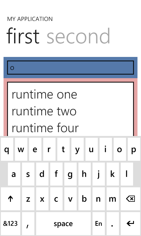
So, taking a few of the coloring concepts from earlier, you see we end up with this idea at runtime when entering text (coloring added to show separation, it won’t look like that in your app)
Download the completed project
I’ve zipped up the sample including the template. Make sure you have the Silverlight for Windows Phone Toolkit installed as well, you might have to re-add that reference to the sample.
[ZIP] 31 KB - AutoCompletePivot.zip
Other notes
Selecting an item may require a few touches by default
When you select an item in the AutoCompleteBox, it will fire SelectionChanged, etc., but you may find that the list shrinks (requiring another press), or that the software keyboard is still up. These need to be worked around today at the app level to match the experience you want to offer your users.
- Consider hooking up to the selection event in the control, then calling Focus() on a visual element elsewhere to remove the software keyboard
- Consider a code fix where if a single item is selected currently, to assume that was the final selection by the user and dismiss the selection system – requires a code workaround since not all app authors may want this.
Enables Landscape page use as well
This also enables using AutoCompleteBox on landscape pages, although it’s very difficult to control the software keyboard (SIP), so you may find that you can hardly see a single item while in landscape mode with the software keyboard up.
You may notice that the native Windows Phone experience rarely offers auto completion in landscape, and as always, Panorama pages should not be Landscape.
IE NOTE
The Internet Explorer browser has an auto complete box in Portrait mode only. In Landscape, it is hidden – and although I don’t have the official word, I believe it is because the software keyboard takes up most of the screen, leaving no space to select items.
So I think the UX guidance is to NOT show auto completes in landscape, but you’re welcome to try. You could add special app logic similar to this to try and fix the problem, but it isn’t pretty:
- Attach to the GotFocus and LostFocus events of the text box in the template (requires some visual tree logic code)
- In your GotFocus handler, if the page is in one of the Landscape modes… you’ll want to open up additional visual space above your page content.
- Temporarily collapse the page title and perhaps its header (very involved if it is a pivot control!)
- When the focus is lost, you want to restore that content. The platform should handle “scrolling” around the viewport in this mode to maximize screen real estate.
Items source size warning
One thing to callout is that the implementation of AutoCompleteBox was originally designed for use on powerful desktops, so the key code path for filtering is designed to be run on the user interface thread. On the Windows Phone, with a single core and mobile ARM hardware, this can be a bottleneck for apps.
Please consider keeping the number of items under 100 if possible, and if you need more, you may need to consider ways to use the “Populating” method to spin up your own filtering work on a background thread (not covered in this post).
Hope this helps.


