Using Silverlight 4 features to create a Zune-like context menu
May 15, 2010
Trying to create a modern, clean and crisp user interface is a challenge – and it’s something that Zune has done rather well in both their software and hardware experiences.
I took a few minutes to experiment with new Silverlight 4 features, including the new Silverlight Toolkit (April 2010 release) that includes a context menu control, to re-style/re-template the menu to look similar to a few other menus.
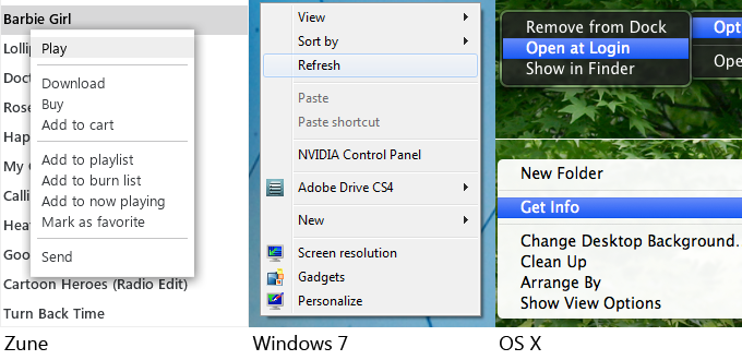
Here’s a quick look at some common context menu visuals – clearly there is some room for artistry in creating a consistent experience with your app.

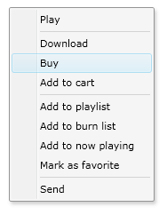
The center context menu, with the Windows look, is what the default Silverlight Toolkit context menu looks most similar to.
New features used
- Right-click input event, added to the platform in Silverlight 4
- Context menu control from the Silverlight Toolkit
- Implicit styles support
- Local fonts
Consider checking out ‘Cosmopolitan’, too
There’s a theme that resembles the modern “codename Metro” design style, similar to that of the Zune user interface, that is available for Silverlight 4. More information is available on Tim’s blog.
What a context menu looks like in XAML
You need an xmlns for the input assembly in the Silverlight Toolkit. Then you setup the ContextMenuService, a ContextMenu instance, plus multiple MenuItem and Separator instances.
A MenuItem can optionally have an icon, though I believe the trend these days is moving away from the icon-heavy menu and toolbar world into a clean & crisp text-only experience… so I prefer a styled context menu that doesn’t optimize for icons.
The XMLNS for the context menu assembly is:
xmlns:controlsInputToolkit="clr-namespace:System.Windows.Controls;assembly=System.Windows.Controls.Input.Toolkit"
You can directly wire up to the Click event, or use Commands. Here’s a sample context menu within a data template:
<ListBox.ItemTemplate>

    <DataTemplate>

        <ContentPresenter Content="{Binding}">

            <controlsInputToolkit:ContextMenuService.ContextMenu>

                <controlsInputToolkit:ContextMenu>

                    <controlsInputToolkit:MenuItem Header="Play" Click="OnMenuItemClick"/>


                    <controlsInputToolkit:Separator/>


                    <controlsInputToolkit:MenuItem Header="Download" Click="OnMenuItemClick"/>

                    <controlsInputToolkit:MenuItem Header="Buy" Click="OnMenuItemClick"/>

                    <controlsInputToolkit:MenuItem Header="Add to cart" Click="OnMenuItemClick"/>


                    <controlsInputToolkit:Separator/>


                    <controlsInputToolkit:MenuItem Header="Add to playlist" Click="OnMenuItemClick"/>

                    <controlsInputToolkit:MenuItem Header="Add to burn list" Click="OnMenuItemClick"/>

                    <controlsInputToolkit:MenuItem Header="Add to now playing" Click="OnMenuItemClick"/>

                    <controlsInputToolkit:MenuItem Header="Mark as favorite" Click="OnMenuItemClick"/>


                    <controlsInputToolkit:Separator/>


                    <controlsInputToolkit:MenuItem Header="Send" Click="OnMenuItemClick"/>


                </controlsInputToolkit:ContextMenu>

            </controlsInputToolkit:ContextMenuService.ContextMenu>

        </ContentPresenter>

    </DataTemplate>

</ListBox.ItemTemplate>
And here’s what it looks like:

To use the ContextMenu, make sure your project includes references to both the toolkit’s System.Windows.Controls.Input.Toolkit.dll as well as the SDK’s System.Windows.Controls.dll.
Now I’d like to make this look more Zune-like.
Using implicit styles
So there are multiple ways to have a style (predefined look, settings and template) on your object:
- Default style key – the default template and style that the creator of the control had in mind. No work required.
- Implicit styles defined in Resources – in Silverlight 4, a Style defined by a user, but without an x:Key property, will automatically apply to all scoped controls of that type.
- Static resource styles defined in Resources – the standard experience up until now, having a Style with an x:Key, then setting the Style=”{StaticResource MyKeyName}” on any and all controls that want to use that style.
- Setting properties directly on an object.
So here is a standard, simple style for a Button, with the key:
<UserControl.Resources>

    <Style TargetType="Button" x:Key="MyButtonStyle">

        <Setter Property="Background" Value="Blue"/>

    </Style>

</UserControl.Resources>
Here’s how you reference it:
<Button Style="{StaticResource MyButtonStyle}" Content="OK"/>And now let’s make that into an implicit style for Silverlight 4. Just remove the x:Key:
<UserControl.Resources>

    <Style TargetType="Button">

        <Setter Property="Background" Value="Blue"/>

    </Style>

</UserControl.Resources>
And here’s how you reference that style – you don’t – it’s implicit:
<Button Content="OK"/>
Small caveat, fyi: there is a bug with implicit styles not necessarily being applied within data templates. To work around this, I had to move to explicit styles (adding an x:Key to the style, then setting the Style property in the DataTemplate’s XAML to the static resource’s key).
Local fonts
I also used a feature of Silverlight 4 that lets me pick up and use local fonts on the machine. I’m using the ‘Segoe UI’ font, a key part of the Windows 7 user experience and visual identity.
However I also define fallback fonts, just like you would in HTML:
<Setter Property="FontFamily" Value="Segoe UI, Tahoma, Arial"/>
My Zune-like context menu
Here are the templates I ended up creating using Expression Blend.
To achieve the fade-in effect, I faked a little and used a Loaded event trigger, so the first time any particular context menu is shown, it will quickly fade – but subsequent presentations of the same instance will not fade, for a faster, more performant feel.
ContextMenu Style
<Style TargetType="controlsInputToolkit:ContextMenu" x:Key="ZuneLikeContextMenu">

    <Setter Property="Background" Value="#FFFFFFFF"/>

    <Setter Property="BorderThickness" Value="0,1,0,1"/>

    <Setter Property="BorderBrush" Value="#0D000000"/>

    <Setter Property="Padding" Value="0,4,0,4"/>

    <Setter Property="Template">

        <Setter.Value>

            <ControlTemplate TargetType="controlsInputToolkit:ContextMenu">

                <Border

                    x:Name="Menu"

                    Opacity="0"

                    BorderBrush="{TemplateBinding BorderBrush}"

                    BorderThickness="{TemplateBinding BorderThickness}"

                    Background="{TemplateBinding Background}"

                    CornerRadius="0">

                    <Border.Effect>

                        <DropShadowEffect

                            ShadowDepth="0" Opacity="0.6" BlurRadius="22"/>

                    </Border.Effect>

                    <Border.Triggers>

                        <EventTrigger RoutedEvent="Rectangle.Loaded">

                            <BeginStoryboard>

                                <Storyboard>

                                    <DoubleAnimation

                                        Duration="0:0:0.2"

                                        To="1"

                                        Storyboard.TargetProperty="Opacity"

                                        Storyboard.TargetName="Menu"/>

                                </Storyboard>

                            </BeginStoryboard>

                        </EventTrigger>

                    </Border.Triggers>

                    <Grid>

                        <ItemsPresenter Margin="{TemplateBinding Padding}"/>

                    </Grid>

                </Border>

            </ControlTemplate>

        </Setter.Value>

    </Setter>

</Style>
Separator Style
<Style TargetType="controlsInputToolkit:Separator" x:Key="ZuneLikeSeparator">

    <Setter Property="Background" Value="LightGray"/>

    <Setter Property="IsTabStop" Value="False"/>

    <Setter Property="Margin" Value="6,2,6,2"/>

    <Setter Property="Template">

        <Setter.Value>

            <ControlTemplate TargetType="controlsInputToolkit:Separator">

                <Border

                    BorderThickness="{TemplateBinding BorderThickness}"

                    BorderBrush="{TemplateBinding BorderBrush}"

                    Background="{TemplateBinding Background}"

                    Height="1"/>

            </ControlTemplate>

        </Setter.Value>

    </Setter>

</Style>
MenuItem Style
<Style TargetType="controlsInputToolkit:MenuItem" x:Key="ZuneLikeMenuItem">

    <Setter Property="Background" Value="Transparent"/>

    <Setter Property="FontSize" Value="14"/>

    <Setter Property="FontFamily" Value="Segoe UI, Tahoma, Arial"/>

    <Setter Property="BorderBrush" Value="Transparent"/>

    <Setter Property="BorderThickness" Value="0"/>

    <Setter Property="Padding" Value="8,2,10,2"/>

    <Setter Property="Template">

        <Setter.Value>

            <ControlTemplate TargetType="controlsInputToolkit:MenuItem">

                <Grid>

                    <VisualStateManager.VisualStateGroups>

                        <VisualStateGroup x:Name="CommonStates">

                            <VisualState x:Name="Normal"/>

                            <VisualState x:Name="Disabled">

                                <Storyboard>

                                    <DoubleAnimation Duration="0" Storyboard.TargetName="Presenter" Storyboard.TargetProperty="Opacity" To="0.5"/>

                                </Storyboard>

                            </VisualState>

                        </VisualStateGroup>

                        <VisualStateGroup x:Name="FocusStates">

                            <VisualState x:Name="Unfocused"/>

                            <VisualState x:Name="Focused">

                                <Storyboard>

                                    <DoubleAnimation Duration="0" Storyboard.TargetName="Bg" Storyboard.TargetProperty="Opacity" To="1"/>

                                    <DoubleAnimation Duration="0" Storyboard.TargetName="IconPresenter" Storyboard.TargetProperty="Opacity" To="1"/>

                                    <DoubleAnimation Duration="0" Storyboard.TargetName="Presenter" Storyboard.TargetProperty="Opacity" To="1"/>

                                </Storyboard>

                            </VisualState>

                        </VisualStateGroup>

                    </VisualStateManager.VisualStateGroups>

                    <Rectangle

                        RadiusX="0"

                        RadiusY="0"

                        Fill="{TemplateBinding Background}"

                        Stroke="{TemplateBinding BorderBrush}"

                        StrokeThickness="{TemplateBinding BorderThickness}"/>

                    <Rectangle

                        x:Name="Bg"

                        RadiusX="0"

                        RadiusY="0"

                        StrokeThickness="0"

                        Opacity="0"

                        Fill="#11000000"/>

                    <Grid Margin="{TemplateBinding Padding}">

                        <Grid.ColumnDefinitions>

                            <ColumnDefinition

                                Width="Auto"/>

                            <ColumnDefinition Width="2"/>

                            <ColumnDefinition Width="*"/>

                            <ColumnDefinition Width="17"/>

                        </Grid.ColumnDefinitions>

                        <ContentPresenter

                            x:Name="IconPresenter"

                            Content="{TemplateBinding Icon}"

                            Margin="1"

                            Opacity=".7"

                            VerticalAlignment="Center"/>

                        <ContentPresenter

                            x:Name="Presenter"

                            MinWidth="120"

                            Opacity=".7"

                            Content="{TemplateBinding Header}"

                            ContentTemplate="{TemplateBinding HeaderTemplate}"

                            Grid.Column="2"/>

                    </Grid>

                </Grid>

            </ControlTemplate>

        </Setter.Value>

    </Setter>

</Style>ZuneLikeContextMenuImplicitStyles.xaml.txt: XAML. Download all three in one file. The file contains both implicit styles plus defined style names.
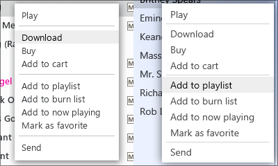
Here’s a comparison, a screenshot of the Zune menu on the left, and my Silverlight 4 context menu on the right:

Hope this helps you create some nice modern-looking Silverlight apps!