How about a Zune-style ChildWindow?
May 21, 2010
Today I’m sharing my new ChildWindow style. It is a differentiated child window designed in that it doesn’t have a close button, has a completely different animation in and out, and I thought I was worth sharing. I’ve included a runtime app so you can run it and see for yourself.
My ChildWindow style

Click on the window above to open a simple Silverlight 4 application that demonstrates the transitions and interactivity. Project download.
Some things to call out:
- I don’t include a Close button in the window chrome.
- I hook up to the OnKeyDown event in my sample implementation. I always try and do this with my ChildWindows so that the escape (ESC) key can be treated as a cancelation of the dialog. Personal preference but a usability win I believe.
- I like a light overlay color instead of a darkening experience, and went for that look.
- My actual implementation uses a value converter to capitalize the title. I’ve removed this from my template for the time being.
The story on my evolving, unnamed theme, and how it relates to “Cosmopolitan”
There’s an excellent “Cosmopolitan” Silverlight project template + theme available that makes building good-looking interfaces a snap, and I’d highly recommend it if you’re looking to modernize the look of a new Silverlight project. I believe it pulls from “codename Metro” design ideas. It just works and as a VS template it rocks!
I’ve built an alternative, but similar theme, over time that I use on many of my projects, and it also pulls from the inspiration of the clean, consistent Zune software design principals.
Now that the “Cosmopolitan” theme is out there, I’ve been taking the time to compare and contrast my similar theme with this, and see where I can make changes. Yeah, the things I do in my free time are baffling…
This is a good exercise because design is a two-way street, comparing and contrasting design decisions and implementations: I’ve learned that I should have been including validation templates in my theme (oops, haven’t used that feature enough). And I’ve shared some minor feedback on parts of the “Cosmopolitan” theme’s implementation details with its designers.
In the future I’ll present the complete theme for many controls, but until that develops, I’m going to continue to share small styles and templates, along with my comments along the way. Previously I blogged my context menu style.
If you’re wondering “why should I use ChildWindow?” - I used to wonder the same thing. But I’m using ChildWindow more now than ever. I’ve discovered the importance of the nice integration with Visual Studio (there’s an item template for child windows), and out-of-browser applications have many uses for a rich modal-style window for sharing information at runtime.
I’ve completely replaced the MessageBox in my out-of-browser applications to instead use a child window designed to replace the message box functionality, offering a consistent visual design even when a message box-like experience is needed. I even use extension methods to add methods to MessageBox to instead use my styled child window.
Other ChildWindow styles
Here’s the standard ChildWindow style and control template that is built into the Silverlight SDK. I’m displaying a password entry form adapted from an app I was experimenting with:

Here is the same window with the “Cosmopolitan” theme’s style applied:

Note: There’s a bug in ChildWindow implicit styling support
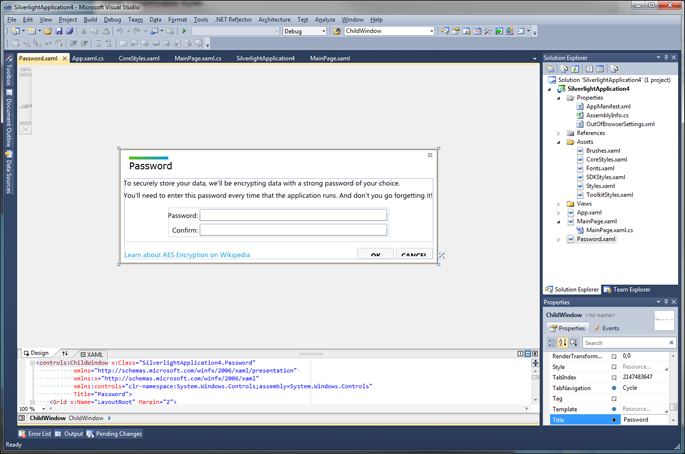
While working on creating themes, I did discover that there’s an unfortunate bug in Silverlight 4 where the implicit styles for ChildWindow are not picked up in certain XAML scenarios. Namely, if you use the handy item template in Visual Studio, the implicit style won’t be picked up.
Oddly, at times Visual Studio will show the proper implicit style, but at runtime it will revert to the standard control default style. Here’s a small screenshot – this is out-of-the-box “Cosmopolitan” theme with a ChildWindow item template.
At design time it looks fine:

At runtime:

It appears that this item template format, where the XAML file of the child window’s root is the child window, doesn’t allow the style that was implicitly defined to be picked up.
No worries. To workaround this, add a Style attribute to the root of the file and a static resource to ChildWindow name. If you’re working with “Cosmopolitan”, then here are the steps:
- Open the Assets/SDKStyles.xaml file
- Navigate to the implicit style for ChildWindow around line 2,440
- Add an x:Key to make the style explicit instead of implicit. x:Key=”ChildWindowStyle”
- Add this line after the (now explicit) style:
<Style TargetType="controls:ChildWindow" BasedOn="{StaticResource ChildWindowStyle}" />- Open your ChildWindow XAML file (mine is called Password.xaml) and add the attribute Style=”{StaticResource ChildWindowStyle}” to the root element
And here’s it at runtime now with our fix/workaround:

Note that whenever defining implicit styles myself, I always start explicit, then provide the implicit in the file using BasedOn.
Download my sample project including the style
[ChildWindowTheme.zip, 71 KB] Includes the theme in App.xaml.
“My yet-to-be-named Zune-inspired theme” components
- ChildWindow (this post)
- ContextMenu